Alford Lodge House Sign
Alford Lodge is a beautiful stone cottage in Somerset. The owner gave me complete reign as to what was to be designed and carved. She only wished to see the piece once it was completed which was fine to me. In fact her words were 'surprise me' which was music to my ears!
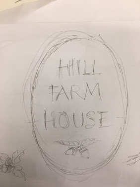
I set about doing a series of designs and played with various letter forms. The first design I drew actually ended up being the one I favoured the most, which was a first for me! I decided to base the Lettering on the Roman lettering which was based on the Roman inscriptions at trajan column. I did this as I wanted the sign to be clear and legible for passing vehicles. Although I wanted the Lettering to be visible I also wanted it to be a bit special.


Something that I was quite excited about was to see how the joined L's would turn out as I have never seen this being done before and I couldn't quite imagine how it would work when it was to be carved. I cut a beautiful piece of Portland stone to the size I had worked out and worked the face and edges back until I had a suitable surface to work. It was such an absolute joy to carve this stone and I have some saved back for something I feel is special in the future.
The part of this carving that I felt I struggled with the most were the O's. I always struggle with these. drawing them, copying them, having them match and carving them. The whole lot. It is something that I really need to keep an eye on and practice. I was pleased with the final result although there are many things which annoy me when I look at it. The spacings of the Lodge as I stated earlier are not quite right. Whether this is because the Alford has predominantly strait letters and the Lodge is predominantly rounded may be the thing which is playing the eye. When the Lodge letters were closer they still didn't look right. I would like to see and hear other peoples views on this. Another thing was the right leg of the R, I felt it was a little too strait and it could of had more movement and flowed better. The shapes of the letters need improving hugely but I feel that I am going in the right direction which is what I tell myself when frustrated with my work. It is a process.
I felt that the letters needed painting as it was such a light piece of stone. It is a sign on the roadside so it needed to be bold and clear enough for passing cars to be able to read it. I was thinking of painting it in a grey/blue which was left over from a memorial I had just finished but Robyn had the idea of painting it in gold. She had a pot of some beautiful gold paint which was able to withstand the elements when it was to be built into a wall. I was apprehensive at first but after a couple of letters I could see it was the right colour and it suited the stones shade well. This picture below was taken in the studio as I was applying the gold paint.

The client was incredibly happy with the commissioned sign and actually got a little emotional when she saw it. She stated that herself and her diseased husband had had many a conversation about getting a sign put at the end of their drive and that her late husband would have been very pleased with it. I cherish these moments and are one of my favourite parts of doing this work.
I had planned to cut a clean rectangle in the stone wall which allowed a 10mm gap around the piece. Then cut out the unwanted wall and pin the sign into the wall using two resin in rods then point in the caps. I think this would have looked really smart once pointed up but my grinder had other plans. I'll draw a little picture to assist.
I haven't worked out what the issue is yet but the grinder decided to pack up on the job so I had to refer to a hammer and bolster. this did the job but it wasn't a clean line and tight. The wall is incredibly old and just crumbled away so I ended up having to take the section down and rebuild and repoint parts. instead of drilling into the wall to insert the rods I had to build up the area around the two bars which will be just as solid in fact its probably better now.
It was interesting seeing it in situ. It looked completely different to me. I was annoyed about not being able to cut a clean line around it but it was more than that. I had only seen it in and around the studio and as I was designing and carving I had not been thinking of the destination that it was destined for. I wonder if it would have turned out different if I had taken a picture of the location and kept referring back to it? I may try this in the future. The sign really took on a new identity in its new environment and this happening may be something fun to play with in the future.
Note that the picture bellow was taken when the mortar was still wet and the moisture which has soaked into the stone hadent dried out.

Comments
Post a Comment