Hill Farm House Sign
Hill Farm House is near to where I am living at the moment near Bruton, Somerset. It's a healthy home with a number of barns and out houses. The woman who lives there is the ex wife of my godfather and she contacted me regarding having a new house sign installed which I am more than happy to oblige her.
Vanessa had very little idea to what she wanted but she did know she wanted it larger than the old sign which was in a truly sorry state. She also liked the look at one of my previous works i had done which was quite bold. She really wanted to have somthing that made a statement and showed that it was hand carved. This freedom is great and is where I feel most comfortable perhaps mainly because I can design something that I feel content about my ability to complete, instead of biting off more than I can chew.
The first question i was asking when thinking of the layout was how the wordjng would fit. Looking at the composition of the name 'Hill Farm House' I noticed that each of the word size was larger than the one before it. This made and attractive shape similar to a triangle. I initially thought of having the words side by side but that would of made the sign very long and the wall which it was to be mounted to is slightly curved so this wasn't a very good option. I liked the idea of having the words stacked on top of each other and I felt this was a good opportunity to do my first elipse shaped sign.

The shape of the words fitted comfortably in the top of the oval/elipse and as it was a old farm I thought a small relief carving under this referring to it would be a nice touch .


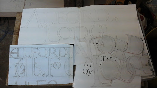
This photo above was my final-ish design. It took me a really long time to draw it and I was constantly moving letters or parts of them slightly. The word 'Hill' was tricky to space and I really struggled with it. This was mainly due to the amount of uprights there are I the word. I learnt that these uprights trick the eye and give the impression that they are spaced far apart even when they are not this is most problematic with the two L's. I ended up shortening the first ever so slightly to a deal with this. There is also a great amount of negative space around the letters in 'FARM'. looking at this picture now I think the F could come in slightly more, it looks as if it's drifting off slightly. There is quite a bit of space around the M when there is a R before hand, I brought this is slightly with the left foot of it tucked into the leg of the R.House was tricky to place bellow the farm and I feel the drawn out leg of the R helps with this as it did look slightly airy beforehand. I think the S could purhaps do with being slightly bigger and the foot of the E looks a bit long but I like it in a way as it gives the word a conclusion.
Robyn gave me a book called British Wildlife to look at for the barley. She told me that when carving a relief it is a good idea to accentuate the parts which make it what it is in your mind. For example it is understandable that someone would confuse a dog breads if they only had a view of all of them from one angle. Certain parts of the dog make it distinguishable from the next so those are the parts to focus on. The thing that makes barley distinguished from wheat are the long strands that grow out of the end of the ears so I excentuated this by having them blowing in the wind. It also gives it a bit of movement which I like. I thought these could look really good if painted gold at the end. I was excited to get the drawing okay'd by the customer and get on with cutting out the stone and cracking on.
Purhaps I shouldn't of taken so long on this design.
Perhapse i should of just done a very rough drawing because I could tell from the first time Vanessa looked at it she didn't like it and she let it be known. I tried to sell the idea to herand told her my reasoning behind the design but she wasn't going to budge. I was deflated to say the least. I was really ready to get a chisel in my hand but now I was to be sitting back at the drawing board.
We sat down at her kitchen table and she proceeded to show me pictures of house signs that she liked. The kind of things she was showing me really werent my bag and it wouldn't be the sort of thing I would gravitate towards and I started to feel a bit anxious thinking if I was going to be able to pull off what she wanted. She drew on a piece of paper roughly what she wanted and she said she wanted the letters to be jazzy as possible, all different shapes. She said 'I want people to see my sign and ask themselves WOW who the hell lives in there' she is self certified mad as a hatter and I personally feel that it's an understatement.

Back at the studio I began to draw somthing resembling what she had requested and sent her a photo. She was happy and that was what she wanted. It was a new feeling for me, I didn't like her idea and I liked less the fact that I had to create this thing for her. There were things which unsettled me and I made all my thoughts clear to her. I didn't like how drawn out the sign was to be, it was going to have to be quite long to fit it all in and I didn't feel as if it would suit where it was to be placed. I didn't like the amount on negative and empty space there was going to be, she made it clear that she didn't want anything in these spaces and wanted them completely clear. I was worried that the words would look as if they were floating and look lost. I only had a set amount of time to get the piece completed as I had a compitment to starting a piece in a weeks time that I was really looking forward to.
Looking back now I should have said that I was going to leave it and start it in a month or somthing so that I had a fresh look at it because I wasn't happy with what I was doing and it was an awful feeling. I really felt as if my hands were tied and I was handcuffed to this design that she had thought up. But I didn't take a breather so there's no point dwelling over that fact.
Anyhow this is what I came up with.

I tried to keep the length down by bring one one the L's up onto the first and like the previous design I brought the left foot of the M into the leg of the R. The idea behind the composition of the HOUSE is that it's falling down the hill and crashing on top of each other the frame is keeping the words contained. I didn't want to start venturing into other kinds of lettering styles as I feel as if I should explore and get more confident with Roman lettering first. Vanessa asked for regular picture updates so that she could be involved and make suggestions to what she wanted.
I always enjoy cutting a piece of stone to size and working the face back as it's a lovely surprise to see all the little fossils and texture. I get my stone fairly rough and strange shapes as it's cheaper. This piece of stone turned out to be really nice and quite hard.
I used carbon paper between my drawing and stone to get my drawing transfered.


Vanessa didn't want it painted or anything else added which
Comments
Post a Comment